

Portugal. The 500th Anniversary of Postal Service in Portugal (IV)
About stamps and plots

09.10.2019
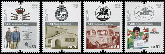
On October 9, 2019, the Portuguese Post issued the 4-series of stamps dedicated to the 500th anniversary of the Portuguese Postal Service.
This time, the emblems and logos of the Portuguese post were in the spotlight. On the four stamps of the series and on two stamps in the souvenir sheet there are emblems that used to be the official symbol of Portuguese mail from 1880 to the present day. This series has become a kind of historical review.
This time, the emblems and logos of the Portuguese post were in the spotlight. On the four stamps of the series and on two stamps in the souvenir sheet there are emblems that used to be the official symbol of Portuguese mail from 1880 to the present day. This series has become a kind of historical review.
The first historical mention of the introduction of the emblem for postal couriers dates back to the Royal Charter of November 6, 1520. Postal messengers were allowed to use the royal coat of arms on their clothes, which gave them the right to freely travel along certain streets, roads and bridges. The charter also gave them permission to wear a sword and dagger to protect the correspondence they were carrying.
In 1880, a new emblem was introduced. The logo of the Directorate General of Post, Telegraph and Lighthouses (Direcção-Geral dos Correios Telégrafos e Faróis) shows a vertically standing envelope crowned with the Royal Crown, on the sides of which there are triple zippers. The logo was largely innovative because it combined the symbol of state power (the crown) and the two main functions of this service: mail delivery (envelope) and telegraph communication (electric lightning). This logo has been used for over 50 years.
In 1936, the Minister of Transport and Communications signed a decree introducing a new logo. The postal emblem also contained elements of the state emblem (armillary sphere and heraldic shield) combined with lightning and letters CTT - the usual abbreviation for the Portuguese postal service. This logo existed much less than its predecessor.
In 1953, the logo was considered no longer relevant. It was decided to return to the image of the equestrian postman, thereby emphasizing the glorious history and traditions of the Portuguese post. The artist Jaime Martins Barata designed a new logo that turned out to be so recognizable that it became one of the strongest symbols of the Portuguese post and was used for more than 60 years.
From that moment on, a rider riding a horse with a postal horn in his hand firmly established himself on the Portuguese postal emblem. All subsequent revisions of the logo made only a few design changes, without affecting the basic concept of the symbol.
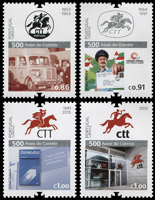
In January 1964, another emblem with a new, more modern design appeared in the CTT Official Gazette. It was still the image of a postal messenger on horseback, but more stylized and more dynamic. The horse's figure has become more elongated, it quickly jumps forward. The cloak that flutters behind the postman also emphasizes the speed of movement, symbolizing the speed of delivery of correspondence.
Two modern logos of 1991 and 2015 are depicted on the stamps of the souvenir sheet.
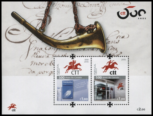
The appearance of the 1991 logo is associated with the restructuring of mail, which took place in the 1990s. Designer Jose Brando created a brighter, more modern logo design, but retaining the basic elements: a horse, a postman with a horn in one hand and a letter in the other. From that moment on, the color of the mail logo has now become familiar with the red color. In 2015, CTT again underwent a reorganization, which affected, among other things, external attributes - the mail logo was redesigned again. This time, the mail messenger for some reason lost his clothes, a beautiful cloak and letter, but on the other hand he acquired a more muscular figure, and the horse appeared to be more resilient and faster. Apparently, the image of the Portuguese post was influenced by the global trend towards a healthy lifestyle.
In total, on stamps and a souvenir sheet, you can count as many as 7 images of postal couriers of different types and colors. So if you look closely, this series was very richly saturated with horses.
Перейти в каталог